Turnup.Travel
Integrating a functional checkout system
Turnup.Travel is a leading travel agency committed to providing memorable travel experiences to clients worldwide. Their services include personalized travel planning, guided tours, adventure trips, and luxury vacations.
Project Brief
To redesign the website to include a working checkout system. The upgrade was to improve the user experience, increase bookings and make the payment process easier and smoother.
The Challenge
The website had an outdated design creating navigation problems without a proper checkout system for the users. It also wasn’t optimized for mobile devices, which became an issue as more users accessed it on their phones. These issues highlighted the need for a complete redesign to meet modern e-commerce standards and customer expectations.
The Solution
To solve for the issues above, we completely redesigned the website, focusing on creating a user-friendly checkout system. Here’s what we did:
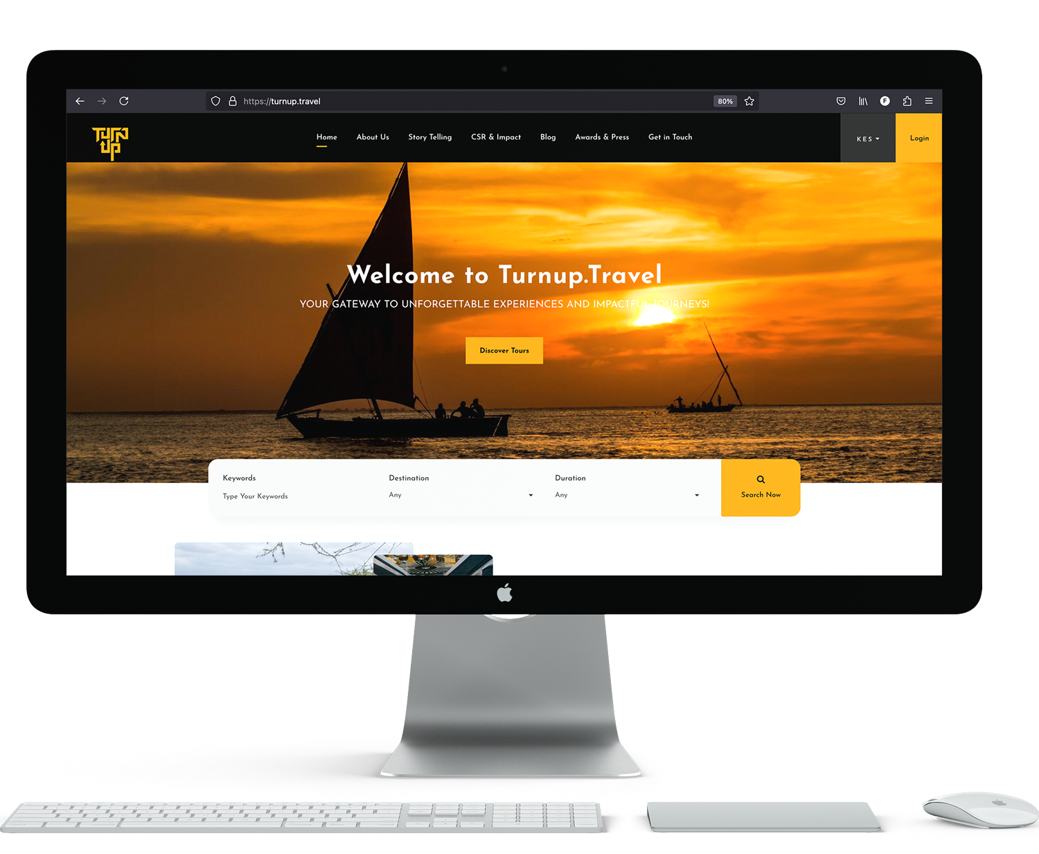
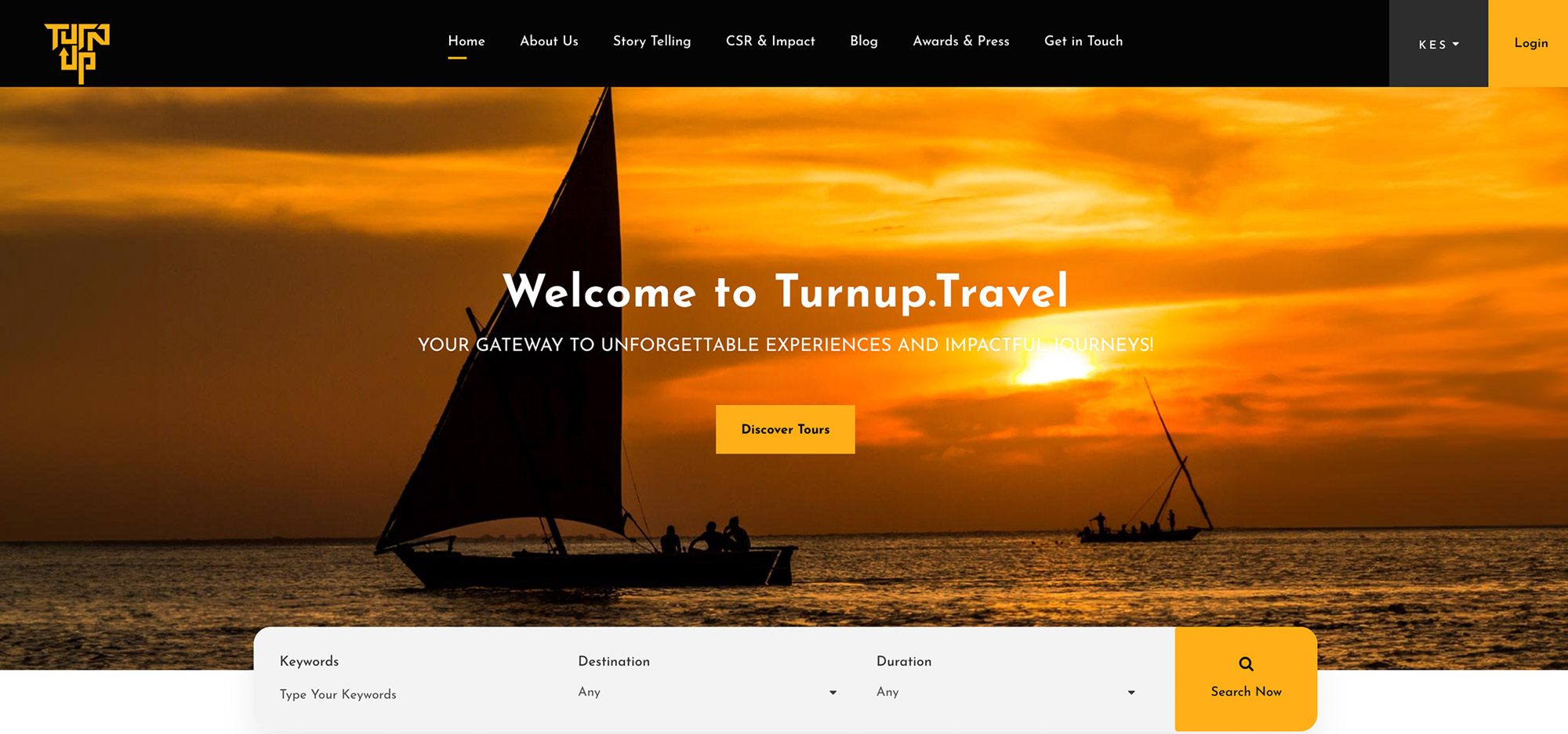
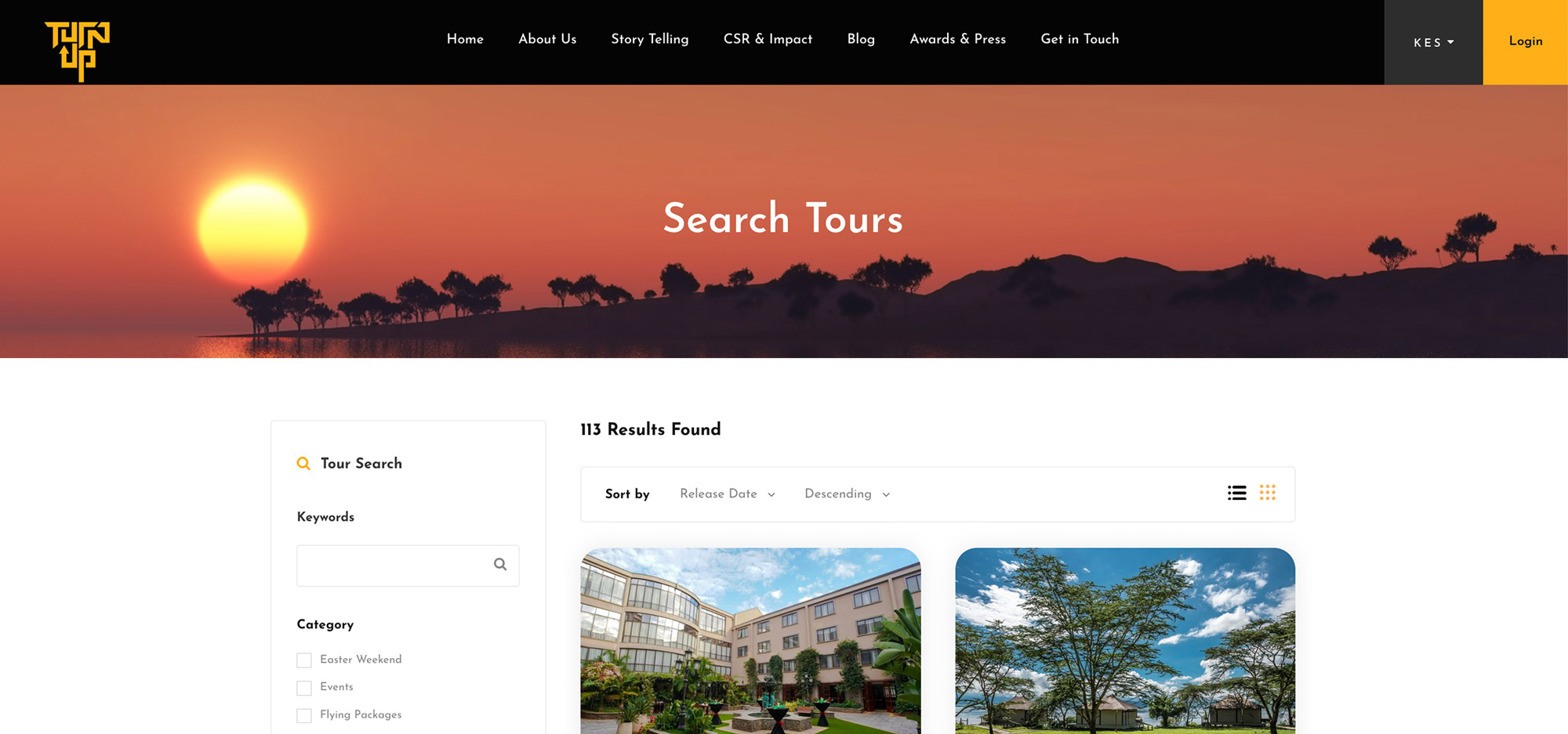
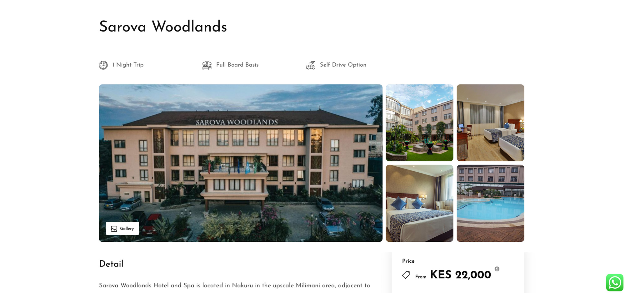
Easy-to-Use Design and Simplified Booking: We made the website simple to navigate, with a clean and modern look. The booking process is now just a few easy steps, allowing customers to choose tours and customize their plans before checking out.
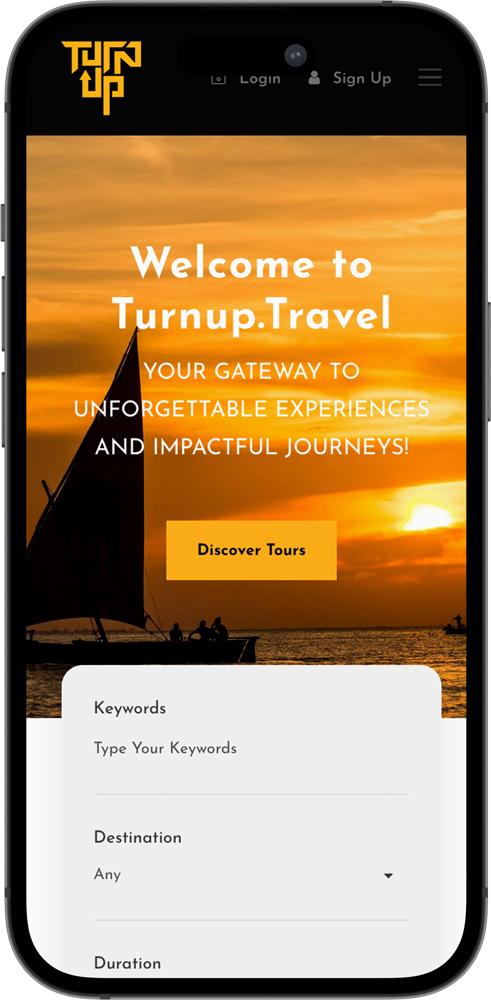
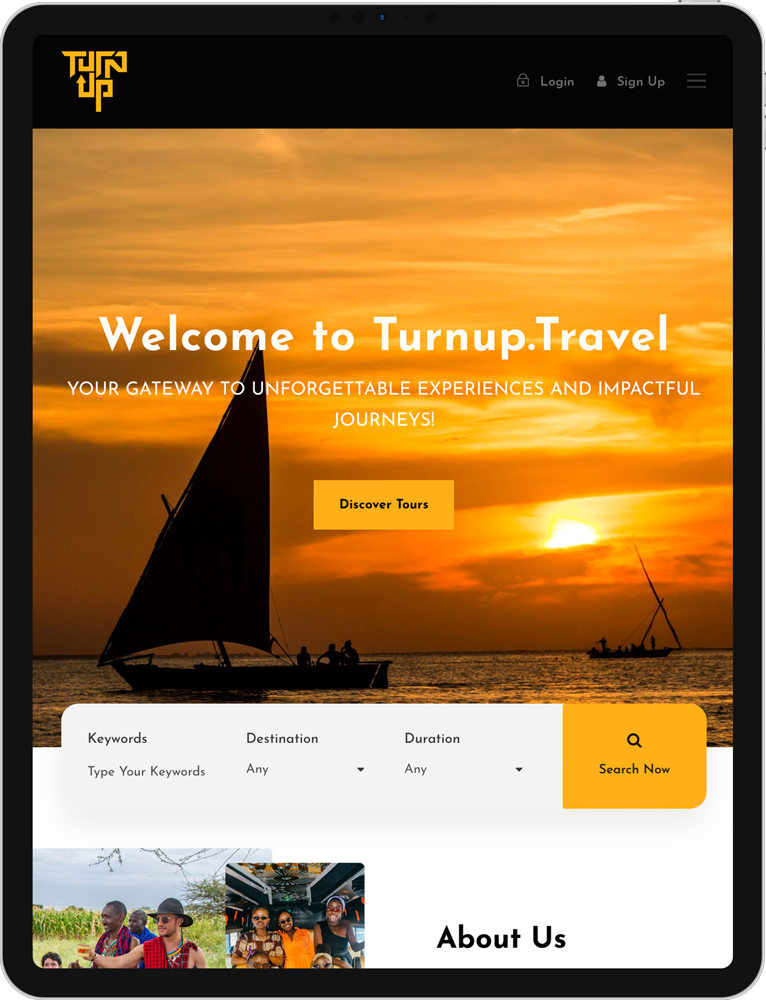
Mobile-Friendly: The new website works well on all devices—desktops, tablets, and smartphones—so customers can book their tours anytime, anywhere.
Strong Security and Faster Performance: We implemented strong security measures to protect customer information and ensure quick load times for a better overall experience.
The Results
The redesigned website has significantly boosted user satisfaction and increased bookings. Here are the key results:
More Completed Bookings: The easier booking process and secure checkout system have helped reduce the number of people leaving without finishing their purchases, leading to more completed bookings.
Better User Experience and Increased Mobile Bookings: Customers have praised the website for being easy to use and modern and the improved mobile design has resulted in more bookings from smartphones and tablets.
Greater Security: Customers feel safer making payments, which has increased their trust and led to more repeat business.
By focusing on user experience and adding a strong checkout system, Turnup.Travel has improved its online presence and shown its commitment to excellent customer service.


Prototyping
To enhance customer satisfaction and streamline our operations, we embarked on a project to redesign our website, focusing on integrating a functional checkout system. This upgrade aimed to improve user experience, increase conversions, and offer seamless booking and payment processes.
The primary issues included:
- Complex Booking Process: The existing booking system was cumbersome and time-consuming, leading to customer frustration.
- Lack of a Functional Checkout System: The absence of an integrated and secure checkout process made it difficult for customers to complete transactions smoothly.
- Inconsistent User Interface: The website’s design was outdated and inconsistent, causing navigation issues and detracting from the overall user experience.
- Limited Mobile Compatibility: With an increasing number of users accessing the site via mobile devices, the lack of mobile optimization was a significant drawback.
These challenges underscored the need for a comprehensive website redesign to align with modern e-commerce standards and meet customer expectations.
